
Large Software Projects: Structuring the Frontend
Posted on October 17, 2025 • 10 minutes • 2064 words • Other languages: Español
This post is part of my Large Software Projects blog series .
- Code Source
- Premature Optimization Warning
- UX Sketching
- Centralizing Information
- Abstracting Layouts
- The Compound Component Pattern
- The Factory Design Pattern
- Implementation Results
- What’s Next?
In the previous installment , we closed the build-deploy loop, achieving automated Continuous Deployment for the tas (Town Admin System) on our Coolify VPS. We now have a solid, production-ready pipeline.
With infrastructure sorted, it’s time to shift our focus back to delivering value: building the user interface. An application is only as good as its architecture, and building a consistent, large-scale UI requires careful planning and the adoption of strong design patterns.
Code Source
All code snippets shown in this post are available in the dedicated branch for this article on the project’s GitHub repository:
https://github.com/franBec/tas/tree/feature/2025-10-17
Premature Optimization Warning
Before we dive in, I want to address a valid point: for a project of this size, much of the architecture I’m about to implement could be considered premature optimization. There’s nothing inherently wrong with having some duplicated code or a simpler structure when a project is just starting out.
I’m taking this more complex approach for two main reasons:
- Future-Proofing: I’m building with the assumption that this project could grow significantly. These patterns will make it easier to scale and maintain in the long run, even if that future isn’t guaranteed.
- Educational Purposes: This series is about exploring best practices for large software projects. Demonstrating these patterns is a core goal, even if they’re overkill for the current state of the application.
As Donald Knuth said:
Premature optimization is the root of all evil
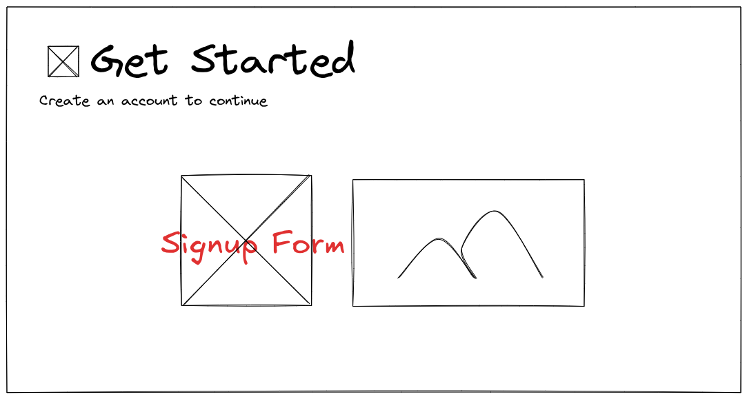
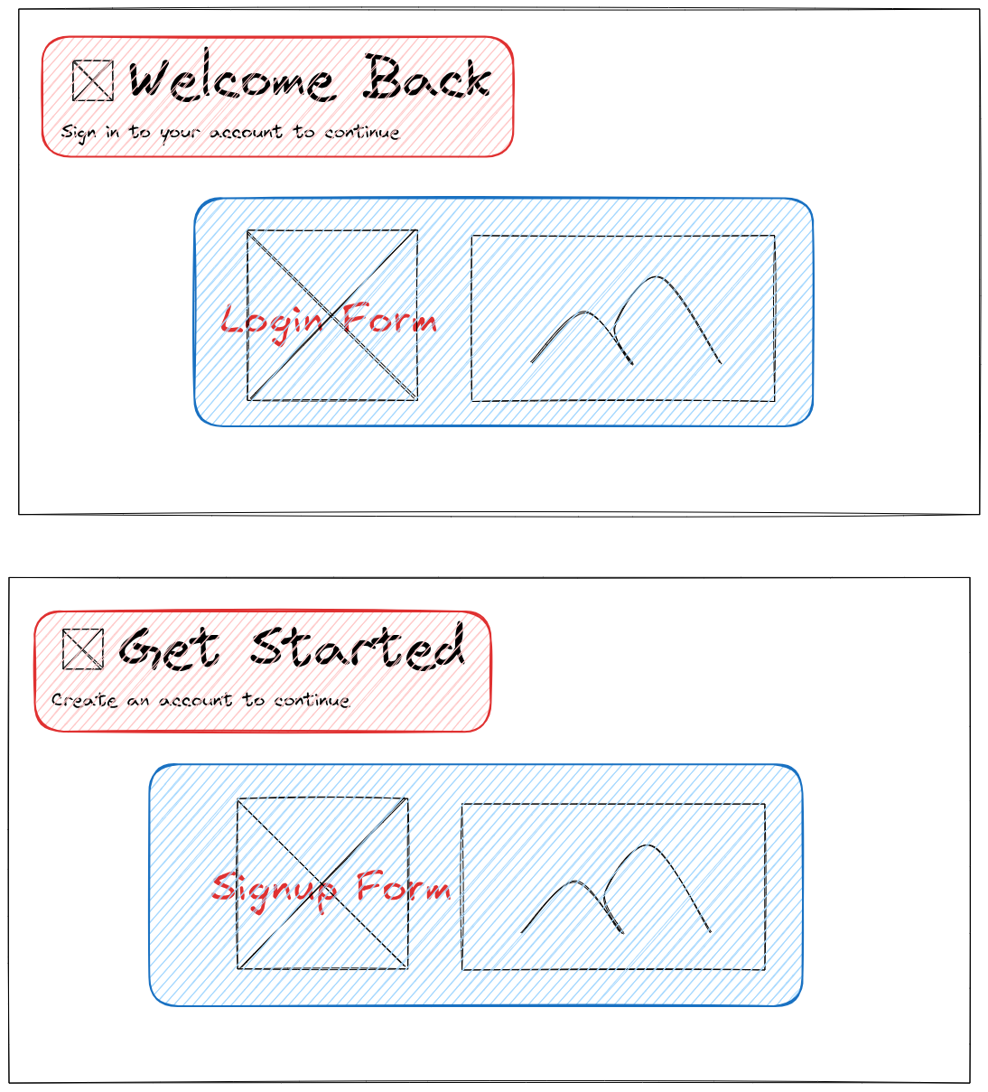
UX Sketching
Before writing a single line of component code, I use simple sketching tools—in my case, Excalidraw —to visualize key screens and user flows. This quickly translates abstract requirements into concrete interface blueprints.
Here are the primary sketches for the core routes we need to implement:
- Home Page (
/): This will be the entry point, introducing the system and offering basic navigation.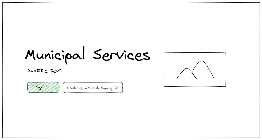
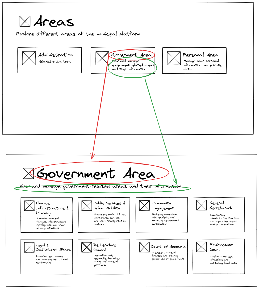
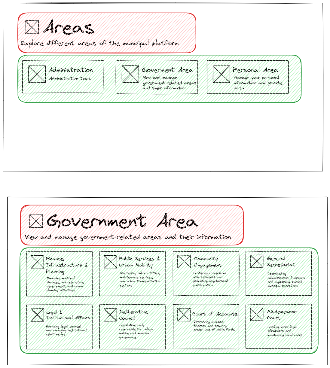
- Areas Index (
/areas): A dashboard displaying various large sections of the municipal system (Government, Administration, Personal).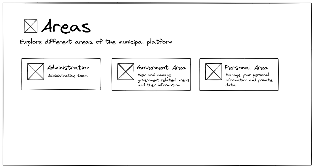
- Government Area Dashboard (
/areas/gov): The entry screen for government users, offering access to specific departments (Finance, Public Services, etc.).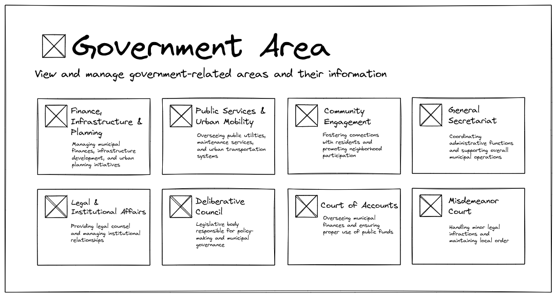
- Authentication Pages (
/sign-inand/sign-up): Standard forms for user authentication, maintaining the consistent visual style.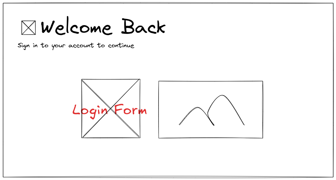
These sketches are our contract for the UI. Now we need an architecture that supports them consistently.
Centralizing Information
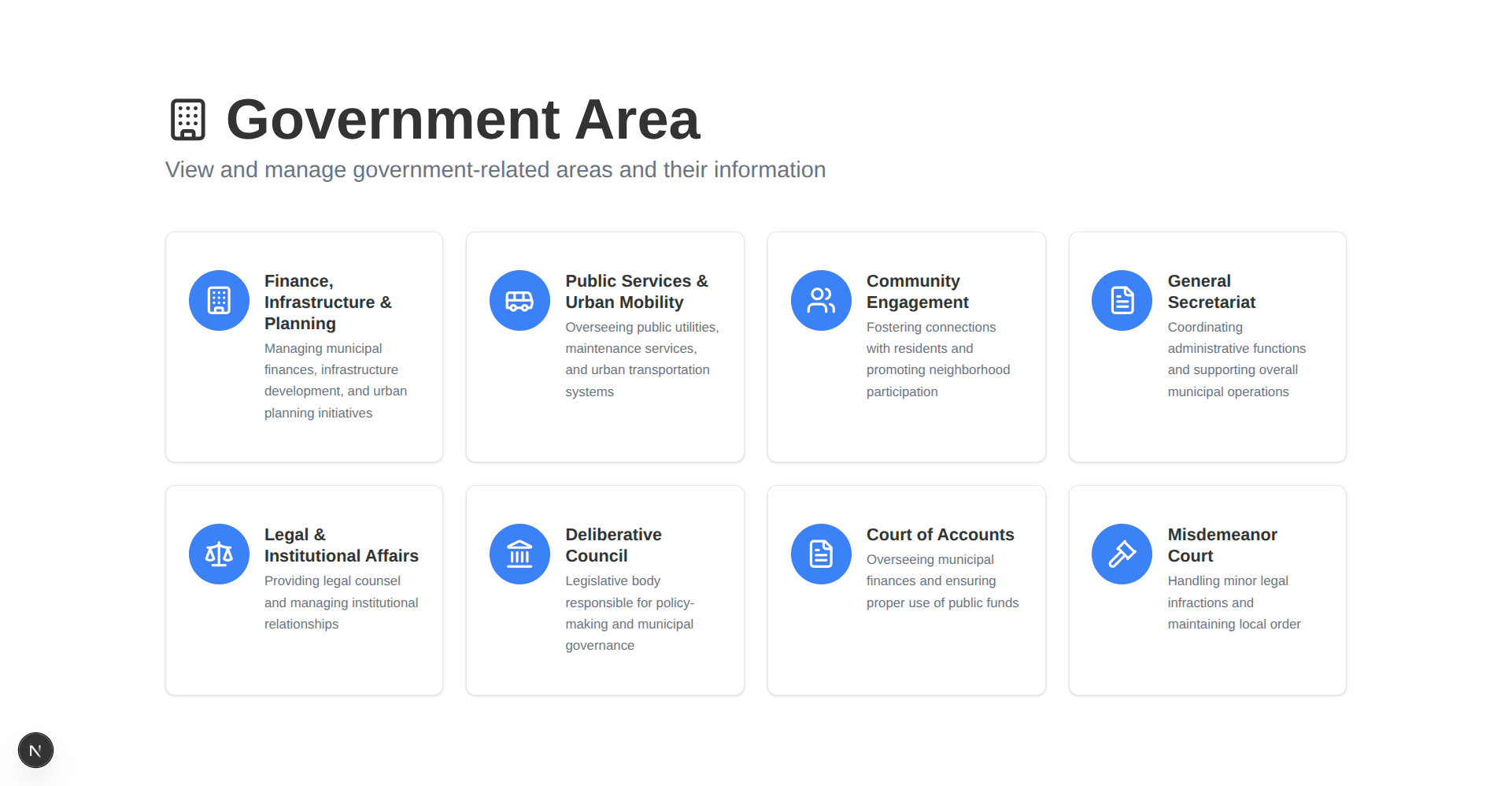
A quick analysis of the sketches reveals a structural problem: information redundancy.
For instance, the card on the /areas page that links to the Government Area has the title “Government Area” and a subtitle “View and manage government-related areas and their information.” These are the exact same title and subtitle used on the /areas/gov page itself.
If the name of the “Government Area” changes, we would have to update it in two separate files—one for the card, and one for the page header. This is a classic violation of the DRY (Don’t Repeat Yourself) principle .
The solution is to centralize all page metadata, icons, titles, and hierarchical relationships into a single source of truth, independent of Next.js’s file-based routing system.
This is an approach commonly used in large systems to maintain consistency across hundreds of pages (source, trust me bro, I’ve worked with long yaml files that do exactly this).
We introduce src/components/lib/routes.ts:
//imports
export interface RouteNode {
uri: string;
title?: string;
subtitle?: string;
icon?: React.ComponentType<{ className?: string }>;
children?: Record<string, RouteNode>;
}
export const routes: Record<string, RouteNode> = {
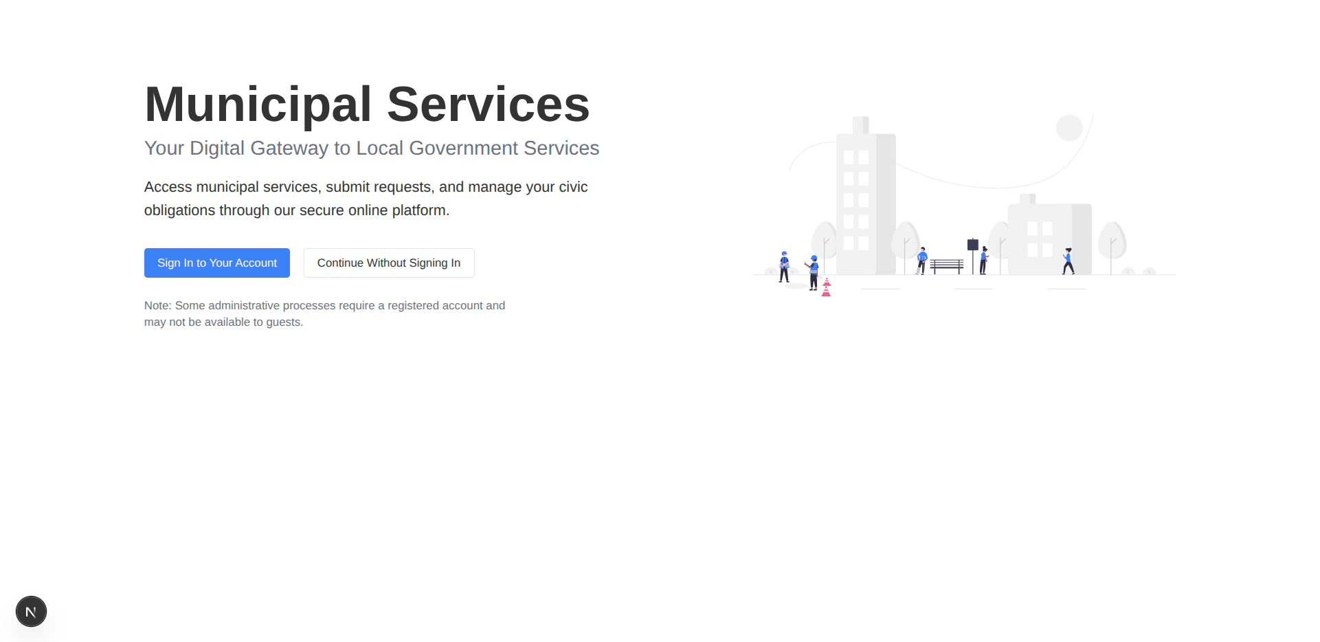
"/": {
uri: "/",
title: "Municipal Services",
subtitle: "Your Digital Gateway to Local Government Services",
},
"/areas": {
uri: "/areas",
title: "Areas",
subtitle: "Explore different areas of the municipal platform",
icon: Building,
children: {
"/areas/admin": {
uri: "/areas/admin",
title: "Administration",
subtitle: "Administrative tools",
icon: Users,
},
"/areas/gov": {
uri: "/areas/gov",
title: "Government Area",
subtitle:
"View and manage government-related areas and their information",
icon: Building,
children: {
// the children of "/areas/gov"
},
},
"/areas/personal": {
uri: "/areas/personal",
title: "Personal Area",
subtitle: "Manage your personal information and private data",
icon: User,
children: {
// the children of "/areas/personal"
},
},
},
},
"/sign-in": {
uri: "/sign-in",
title: "Welcome Back",
subtitle: "Sign in to your account to continue",
icon: LogIn,
},
"/sign-up": {
uri: "/sign-up",
title: "Get Started",
subtitle: "Create an account to continue",
icon: UserPlus,
},
};
export function getRouteNodeByUri(uri: string) {
const parts = uri.split("/").filter((part) => part !== "");
let currentNode: Record<string, RouteNode> | undefined = routes;
let currentUri = "";
if (uri === "/") {
if (!routes["/"]) {
throw new Error(`Route node not found for URI: ${uri}`);
}
return routes["/"];
}
for (let i = 0; i < parts.length; i++) {
currentUri += "/" + parts[i];
if (!currentNode || !currentNode[currentUri]) {
throw new Error(`Route node not found for URI: ${uri}`);
}
if (i === parts.length - 1) {
return currentNode[currentUri];
}
currentNode = currentNode[currentUri].children;
}
throw new Error(`Route node not found for URI: ${uri}`);
}
This file is now works as a source of truth for different pages metadata such as titles, subtitles, and icons. Any page that may need them for a specific route can now simply call getRouteNodeByUri.
Abstracting Layouts
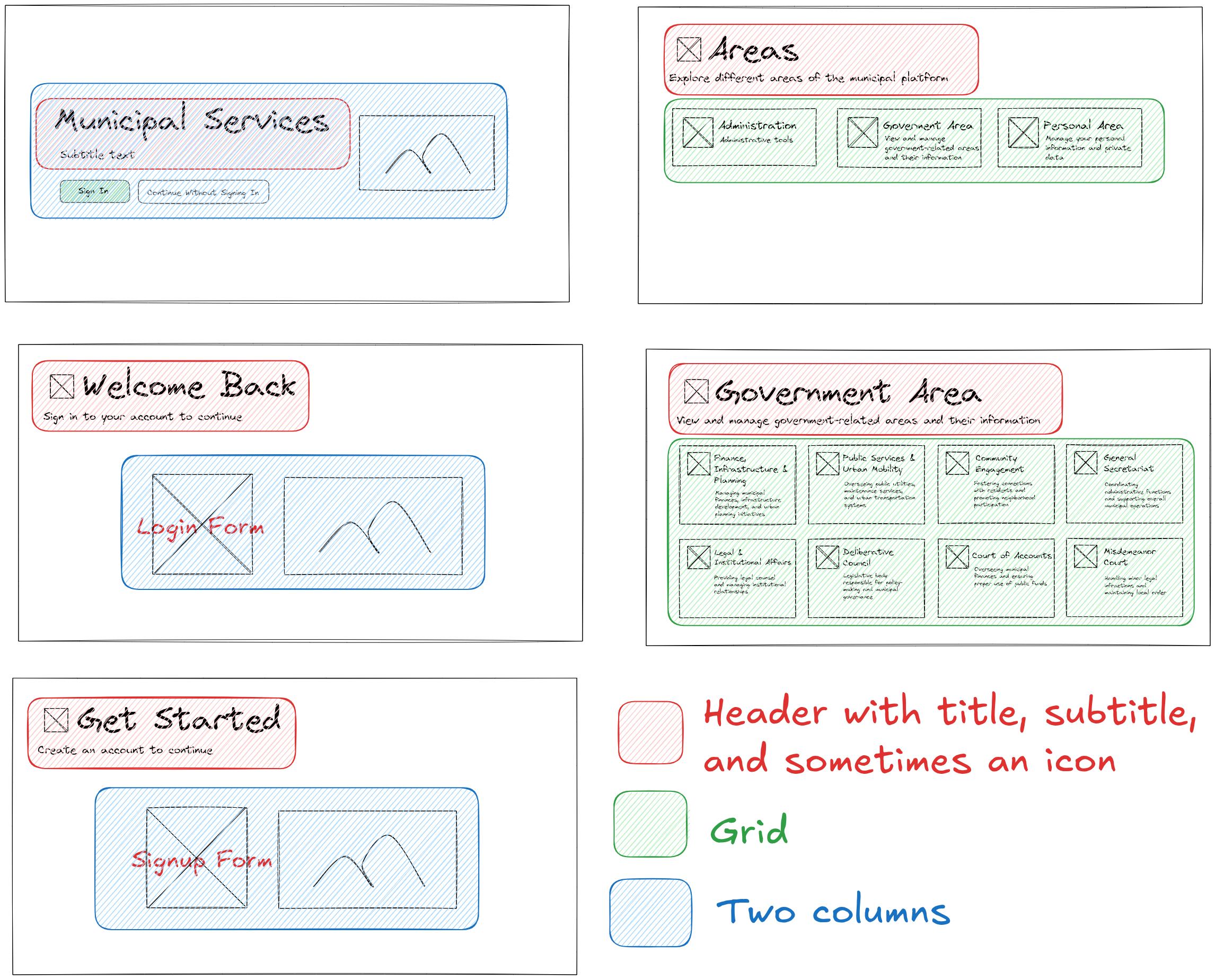
Looking at the mockups again, we observe that pages share common layout structures:
- Header: All pages have a title, subtitle, and sometimes an icon (derived from
src/components/lib/routes.ts). - Structure: Many pages use either a Grid for area selection or a Two Columns layout for forms and auxiliary content (like the sign-in/sign-up pages).
A naïve approach would be to create a monolithic PageLayout component and pass props to control its structure:
// Bad Practice
<PageLayout
  title="My Title"
  subtitle="My Subtitle"
  useGrid={true}
  gridColumns={3}
  showImageColumn={false}
>
  {/* Content */}
</PageLayout>
This traditional prop-passing pattern leads to two major issues:
- Prop Hell and Flag Props: The component becomes cluttered with boolean flags (
useGrid,showImageColumn) and conditional logic (if (useGrid) { return <Grid>... }). - Violating SRP: A single
PageLayoutcomponent would be responsible for rendering many different layout types.
As Robert C. Martin states in Clean Code:
Functions should do one thing. They should do it well. They should do it only
The same principle applies to components. We don’t want a PageLayout that has to guess what shape it should take.
The Compound Component Pattern
The ideal solution for this problem is the Compound Component Pattern . Instead of passing flags, we allow the consumer (the page) to compose the layout using smaller, explicit building blocks.
The core idea is to attach sub-components (like Header, TwoColumns, Grid) as static properties to the main parent component (PageLayout).
// The desired usage pattern
<PageLayout>
  <PageLayout.Header title="..." subtitle="..." />
  <PageLayout.TwoColumns>
    {/* Column 1 Content */}
    {/* Column 2 Content */}
  </PageLayout.TwoColumns>
</PageLayout>
This approach enforces explicit structure and ensures that each sub-component only handles its specific layout concern.
If you are new to this pattern and want a deeper dive, I highly recommend watching this video
While the video uses the React Context API , we don’t because these components are purely structural layout components; they don’t share state or data that needs prop drilling. They are simply building blocks.
Here is src/components/layout/page-layout.tsx, the implementation of our structural components using the compound pattern:
import { cn } from "@/lib/utils";

interface PageLayoutProps {
    children: React.ReactNode;
    className?: string;
}

export function PageLayout({ children, className }: PageLayoutProps) {
    return (
        <div
            className={cn("min-h-screen bg-background text-foreground", className)}
        >
            <div className="py-16 md:py-24">
                <div className="max-w-7xl mx-auto px-4">{children}</div>
            </div>
        </div>
    );
}

interface PageHeaderProps {
    title?: string;
    subtitle?: string;
    description?: string;
    icon?: React.ComponentType<{ className?: string }>;
    className?: string;
}

PageLayout.Header = function PageHeader({
                                            title,
                                            subtitle,
                                            description,
                                            icon: Icon,
                                            className,
                                        }: PageHeaderProps) {
    return (
        <div className={cn("mb-12", className)}>
            {title && (
                <div className="flex items-center gap-4">
                    {Icon && <Icon className="w-12 h-12" />}
                    <h1 className="text-4xl md:text-6xl font-bold">{title}</h1>
                </div>
            )}
            {subtitle && (
                <p className="text-xl md:text-2xl text-muted-foreground mt-2 mb-4">
                    {subtitle}
                </p>
            )}
            {description && <p className="text-lg">{description}</p>}
        </div>
    );
};

interface TwoColumnProps {
    children: React.ReactNode;
    reverse?: boolean;
    className?: string;
}

PageLayout.TwoColumn = function TwoColumn({
                                              children,
                                              reverse = false,
                                              className,
                                          }: TwoColumnProps) {
    return (
        <div
            className={cn(
                "grid md:grid-cols-2 gap-12 items-center",
                reverse && "md:grid-flow-dense",
                className
            )}
        >
            {children}
        </div>
    );
};

interface ColumnProps {
    children: React.ReactNode;
    className?: string;
}

PageLayout.LeftColumn = function LeftColumn({
                                                children,
                                                className,
                                            }: ColumnProps) {
    return <div className={cn("space-y-6", className)}>{children}</div>;
};

PageLayout.RightColumn = function RightColumn({
                                                  children,
                                                  className,
                                              }: ColumnProps) {
    return (
        <div className={cn("flex justify-center md:justify-end", className)}>
            {children}
        </div>
    );
};

interface GridProps {
    children: React.ReactNode;
    columns?: 2 | 3 | 4;
    className?: string;
}

PageLayout.Grid = function Grid({
                                    children,
                                    columns = 4,
                                    className,
                                }: GridProps) {
    const gridCols = {
        2: "grid-cols-1 sm:grid-cols-2",
        3: "grid-cols-1 sm:grid-cols-2 lg:grid-cols-3",
        4: "grid-cols-1 sm:grid-cols-2 lg:grid-cols-4",
    };

    return (
        <div className={cn("grid gap-6", gridCols[columns], className)}>
            {children}
        </div>
    );
};
The Factory Design Pattern
We have “Area Grid” pages (like /areas and /areas/gov).
And we have “Auth Two Column” pages (like /sign-in and /sign-up, I decide to leave the landing page out of this on purpose).
Similar pages should be built the same.
We have two tools:
- Centralized route metadata (
src/components/lib/routes.ts). - Structural layout component (
src/components/layout/page-layout.tsx).
When structures are nearly identical, but you want to maintain a clean separation of concerns (e.g., src/components/lib/routes.ts and src/components/layout/page-layout.tsx don’t know and should not know each other exist), the Factory Design Pattern
is the perfect fit.
Here is src/components/layout/page-factory.tsx:
import { getRouteNodeByUri } from "@/lib/routes";
import { AreaCard } from "./area-card";
import { PageLayout } from "./page-layout";

interface AreaWithGridPageProps {
    uri: string;
}

export function createAreaWithGridPage({ uri }: AreaWithGridPageProps) {
    return function AreaWithGridPage() {
        const routeNode = getRouteNodeByUri(uri);

        return (
            <PageLayout>
                <PageLayout.Header
                    title={routeNode.title}
                    subtitle={routeNode.subtitle}
                    icon={routeNode.icon}
                />

                {routeNode.children && (
                    <PageLayout.Grid columns={4}>
                        {Object.values(routeNode.children).map((it) => (
                            <AreaCard
                                key={it.uri}
                                title={it.title}
                                subtitle={it.subtitle}
                                uri={it.uri}
                                icon={it.icon}
                            />
                        ))}
                    </PageLayout.Grid>
                )}
            </PageLayout>
        );
    };
}

interface AuthPageProps {
    uri: string;
    imageSrc: string;
    altText: string;
    placeholderText: string;
}

export function createAuthPage({
                                   uri,
                                   imageSrc,
                                   altText,
                                   placeholderText,
                               }: AuthPageProps) {
    return function AuthPage() {
        const routeNode = getRouteNodeByUri(uri);

        return (
            <PageLayout>
                <PageLayout.TwoColumn>
                    <PageLayout.LeftColumn>
                        <PageLayout.Header
                            title={routeNode.title}
                            subtitle={routeNode.subtitle}
                            icon={routeNode.icon}
                        />
                        <div className="mt-8 p-6 bg-muted rounded-lg border">
                            <p className="text-center text-muted-foreground">
                                {placeholderText}
                            </p>
                        </div>
                    </PageLayout.LeftColumn>

                    <PageLayout.RightColumn>
                        <div className="w-full max-w-md">
                            <img src={imageSrc} alt={altText} className="w-full h-auto" />
                        </div>
                    </PageLayout.RightColumn>
                </PageLayout.TwoColumn>
            </PageLayout>
        );
    };
}
Implementation Results
With our components and factory methods in place, implementing our key pages becomes trivial and highly consistent.
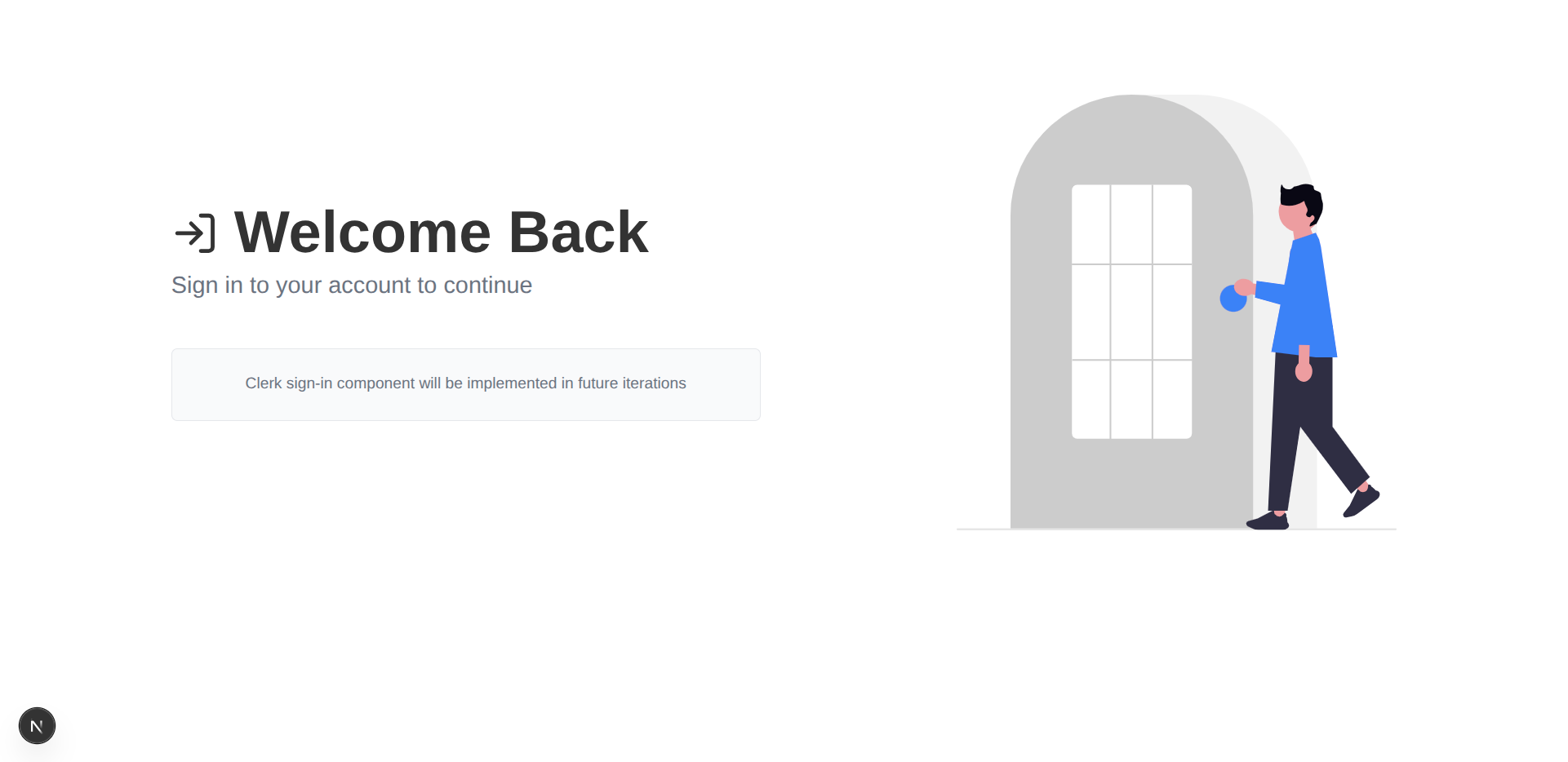
Authentication Pages
The /sign-in and /sign-up pages only need to call the factory function and pass the required form content.
/app/sign-in/page.tsx
import { createAuthPage } from "@/components/layout/page-factory";

export default createAuthPage({
    uri: "/sign-in",
    imageSrc: "/undraw_login_weas.svg",
    altText: "Login",
    placeholderText:
        "Clerk sign-in component will be implemented in future iterations",
});
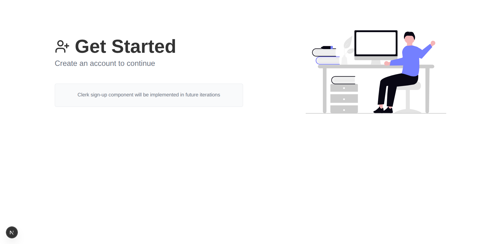
/app/sign-up/page.tsx
import { createAuthPage } from "@/components/layout/page-factory";

export default createAuthPage({
    uri: "/sign-up",
    imageSrc: "/undraw_hello_ccwj.svg",
    altText: "Welcome",
    placeholderText:
        "Clerk sign-up component will be implemented in future iterations",
});
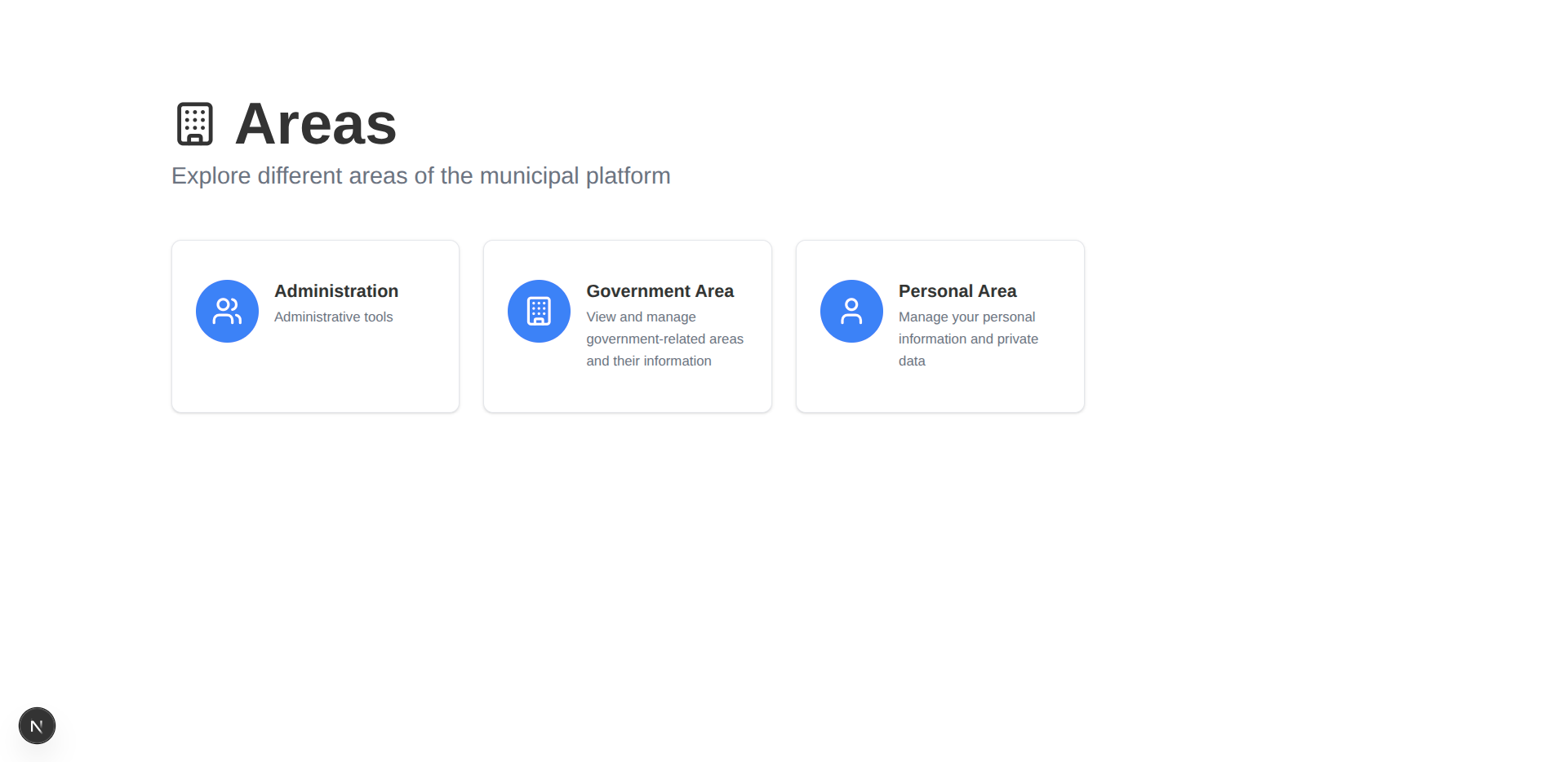
Area Grid Pages
The grid pages are even simpler, requiring only a call to createAreaWithGridPage.
/app/areas/page.tsx
import { createAreaWithGridPage } from "@/components/layout/page-factory";

export default createAreaWithGridPage({ uri: "/areas" });
/app/areas/gov/page.tsx
import { createAreaWithGridPage } from "@/components/layout/page-factory";

export default createAreaWithGridPage({ uri: "/areas/gov" });
Proof of Flexibility
The factory pattern is optional. For unique pages, we can still use the PageLayout and getRouteNodeByUri directly, maintaining metadata consistency while allowing for non-standard content.
/app/page.tsx (Rewritten)
import Image from "next/image";
import Link from "next/link";

import { PageLayout } from "@/components/layout/page-layout";
import { Button } from "@/components/ui/button";
import { getRouteNodeByUri } from "@/lib/routes";

export default function Home() {
    const routeNode = getRouteNodeByUri("/");

    return (
        <PageLayout>
            <PageLayout.TwoColumn>
                <PageLayout.LeftColumn>
                    <PageLayout.Header
                        title={routeNode.title}
                        subtitle={routeNode.subtitle}
                        description="Access municipal services, submit requests, and manage your civic obligations through our secure online platform."
                        className="mb-8"
                    />

                    <div className="flex flex-col sm:flex-row gap-4">
                        <Link href={"/sign-in"}>
                            <Button>Sign In to Your Account</Button>
                        </Link>
                        <Link href={"/areas/gov"}>
                            <Button variant="outline">Continue Without Signing In</Button>
                        </Link>
                    </div>

                    <p className="text-sm text-muted-foreground max-w-md">
                        Note: Some administrative processes require a registered account and
                        may not be available to guests.
                    </p>
                </PageLayout.LeftColumn>

                <PageLayout.RightColumn>
                    <Image
                        src="/undraw_city-life_l74x.svg"
                        alt="City life illustration"
                        width={600}
                        height={400}
                        className="w-full max-w-lg"
                    />
                </PageLayout.RightColumn>
            </PageLayout.TwoColumn>
        </PageLayout>
    );
}
What’s Next?
We have successfully established a foundation for building highly consistent pages:
- Centralized Metadata ensures consistency across display elements.
- The Compound Component pattern enforces a clear, robust structure for page layouts.
- The Factory Pattern minimizes boilerplate and accelerates the creation of standardized pages.
Our current pages exist in isolation. In the next post, we will expand our scope to the entire application:
- The Application Layout: Implementing a persistent structure (Header, Sidebar, Main Content, Footer).
- Global Navigation: Using our centralized
routes.tsfile to generate dynamic navigation links for the sidebar and main menus.
Next Blog: Large Software Projects: Structuring the Frontend