Large Software Projects: Modern Navigation
Posted on October 20, 2025 • 5 minutes • 1038 words • Other languages: Español
This post is part of my Large Software Projects blog series .
- Code Source
- Searching for a Layout
- Customizing the Sidebar
- Header and Footer Components
- Dark Mode
- Applying the Layout Globally
- The Result
- What’s Next?
After establishing our project structure and routing system, it’s time to build a proper UI foundation. Today we’ll implement a professional sidebar layout, add dark mode support, and create a maintainable navigation system based on our routes configuration.
Code Source
All code snippets shown in this post are available in the dedicated branch for this article on the project’s GitHub repository:
https://github.com/franBec/tas/tree/feature/2025-10-20
Searching for a Layout
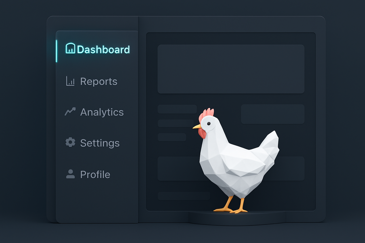
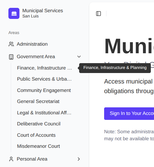
When building a large application, standard components often speed up development significantly. I wanted a compact, collapsible sidebar common in dashboard applications.
Once again I browsed the blocks provided by shadcn/ui and settled on Sidebar 08 for its balance of utility and modern aesthetic.
To pull the necessary files, I executed the following:
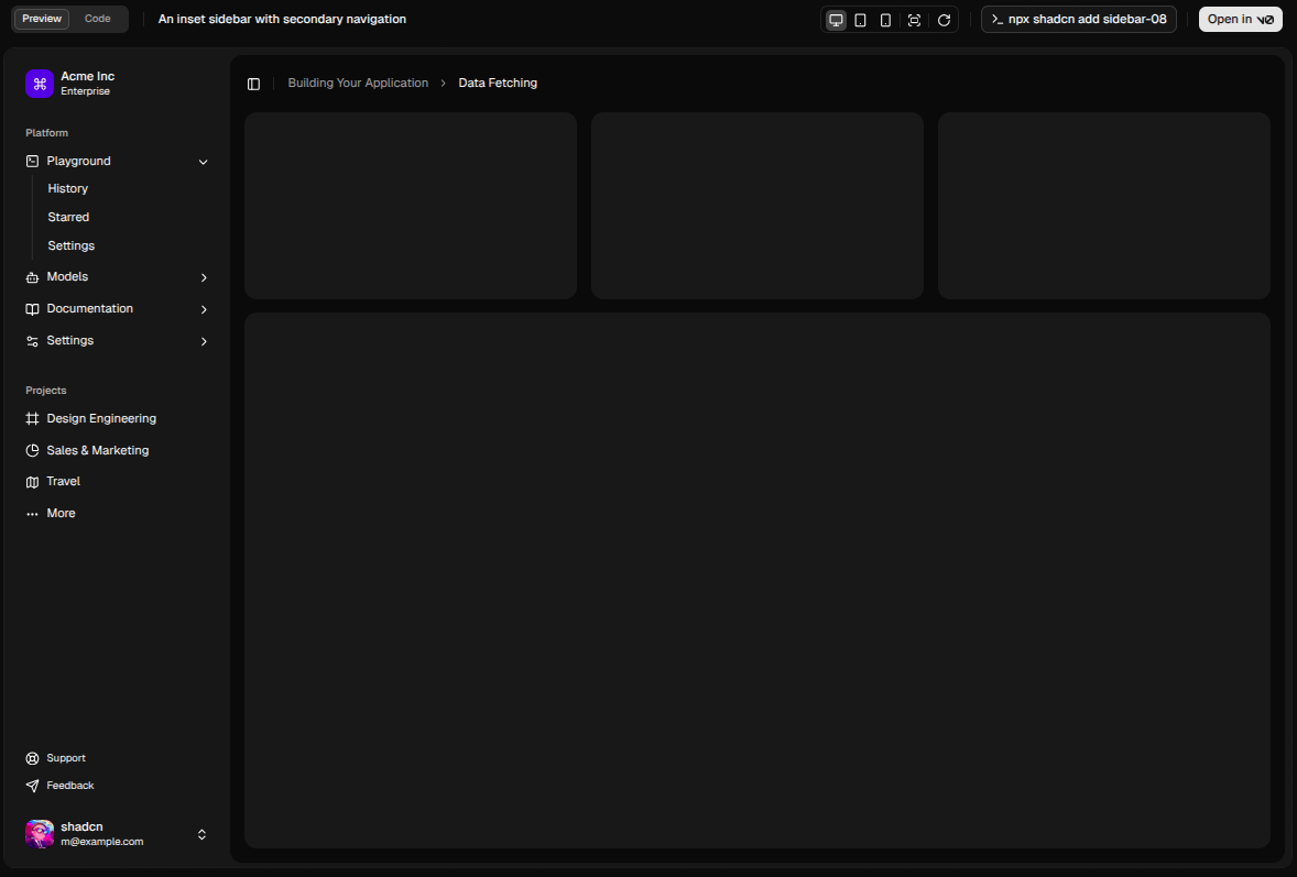
pnpm dlx shadcn@latest add sidebar-08 --overwrite
This command creates several files, but we’ll focus on app-sidebar.tsx - The main sidebar component.
If you start the development server now and visit /dashboard, you will see the bare layout in action.
Customizing the Sidebar
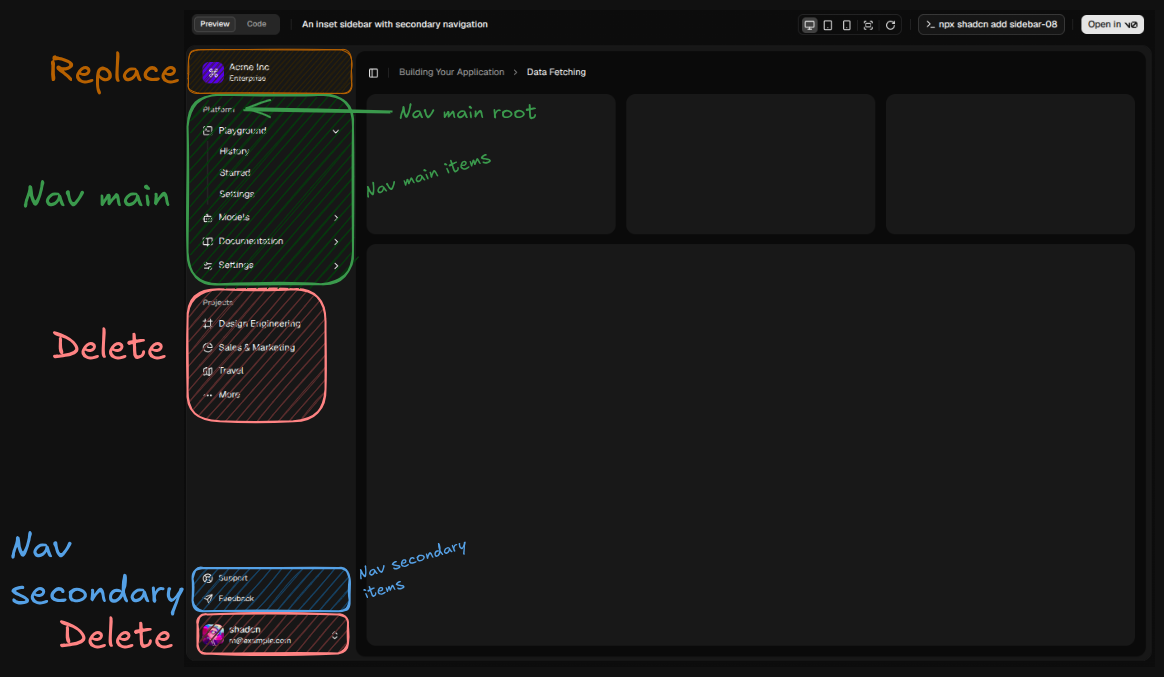
The generated sidebar comes with placeholder content, so let’s make it our own.
Replace Sidebar Header
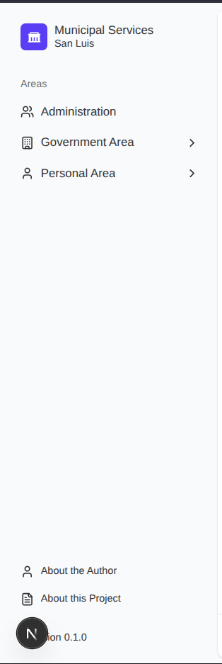
In app-sidebar.tsx, the SidebarMenuButton component acts as the main logo/link.
Let’s replace the generic branding with something fitting for our project. I wanted a “government” icon, so I browsed REMIX ICON and found government-fill which fits perfectly.
Pro tip: Make sure the logo clickable and redirect to “/”, it is standard UX behavior that users expect.
<Sidebar variant="inset" {...props}>
    <SidebarHeader>
        <SidebarMenu>
            <SidebarMenuItem>
                <SidebarMenuButton size="lg" asChild>
                    <Link href="/">
                        <div className="bg-sidebar-primary text-sidebar-primary-foreground flex aspect-square size-8 items-center justify-center rounded-lg">
                            <img
                                src="/government-fill.svg"
                                alt="Government"
                                className="size-4 invert"
                            />
                        </div>
                        <div className="grid flex-1 text-left text-sm leading-tight">
                  <span className="truncate font-medium">
                    Municipal Services
                  </span>
                            <span className="truncate text-xs">San Luis</span>
                        </div>
                    </Link>
                </SidebarMenuButton>
            </SidebarMenuItem>
        </SidebarMenu>
    </SidebarHeader>
    //rest of the Sidebar component
</Sidebar>

Small Sidequest: Favicon
Since I had the icon ready, I took a moment to convert the government-fill SVG into a .ico file and placed it in public/favicon.ico. This is a small detail but crucial for user experience and branding consistency.
Data-Driven Navigation
The default shadcn sidebar uses hardcoded array data for its links. For a large project, navigation must be derived from our central source of truth: src/lib/routes.ts.
First, extend the RouteNode interface:
// src/lib/routes.ts

export enum SidebarContentType {
    NAV_MAIN_ROOT = "NAV_MAIN_ROOT",
    NAV_MAIN_ITEM = "NAV_MAIN_ITEM",
    NAV_SECONDARY_ITEM = "NAV_SECONDARY_ITEM",
}

export interface RouteNode {
    uri: string;
    title?: string;
    subtitle?: string;
    icon?: React.ComponentType<{ className?: string }>;
    children?: Record<string, RouteNode>;
    sidebarContent?: SidebarContentType;
}
Sidebar Rendering Logic
Update app-sidebar.tsx to iterate through routes and render them by section:
- Main Navigation (
nav-main.tsx): Renders high-level application areas (e.g., Administration, Government Area, Personal Area). - Secondary Navigation (
nav-secondary.tsx): Renders utility or meta-links (e.g., “About Author,” “About Project”).
Sadly the code snippet is kinda long, feel free to check the component code in the repo.
Pro tip: Add tooltips for routes with long names that might get truncated:
Header and Footer Components
With the sidebar defined, we needed simple, utilitarian components for the top and bottom of the main viewport.
- The header must remain minimal. Its primary responsibilities are:
- Housing the
SidebarTriggercomponent to toggle the sidebar’s collapsed state. - Integrating the dark mode switch (discussed next).
- Housing the
- The footer is simple text, generally reserved for copyright information or a persistent link back to the documentation. We avoided overloading it; simplicity here prevents distraction.
Dark Mode
Working with stark white interfaces during long coding sessions is brutal. Integrating dark mode is now a mandatory feature for any modern application.
Following the shadcn/ui dark mode guide , I placed the toggle switch in the top-right corner of the Header. This placement is the widely accepted convention and requires the least cognitive load for users looking to change the theme.
Applying the Layout Globally
Now that we have all the pieces, let’s compose them into the main layout src/app/layout.tsx.
import type { Metadata } from "next";
import { Geist, Geist_Mono } from "next/font/google";

import "./globals.css";

import { AppFooter } from "@/components/layout/app-footer";
import { AppHeader } from "@/components/layout/app-header";
import { AppSidebar } from "@/components/layout/app-sidebar";
import { ThemeProvider } from "@/components/theme/theme-provider";
import { SidebarInset, SidebarProvider } from "@/components/ui/sidebar";

const geistSans = Geist({
  variable: "--font-geist-sans",
  subsets: ["latin"],
});

const geistMono = Geist_Mono({
  variable: "--font-geist-mono",
  subsets: ["latin"],
});

export const metadata: Metadata = {
  title: "Municipal Services",
  description:
    "Access municipal services, submit requests, and manage your civic obligations through our secure online platform.",
};

export default function RootLayout({
  children,
}: Readonly<{
  children: React.ReactNode;
}>) {
  return (
    <html lang="en" suppressHydrationWarning>
      <body
        className={`${geistSans.variable} ${geistMono.variable} antialiased`}
      >
        <ThemeProvider
          attribute="class"
          defaultTheme="system"
          enableSystem
          disableTransitionOnChange
        >
          <SidebarProvider>
            <AppSidebar />
            <SidebarInset>
              <AppHeader />
              <main className="flex flex-1 flex-col gap-4 p-4 pt-0">
                {children}
              </main>
              <AppFooter />
            </SidebarInset>
          </SidebarProvider>
        </ThemeProvider>
      </body>
    </html>
  );
}
- Feel free to change the default
metadatato something more fitting of the project.
You’ll notice that with the sidebar, header, and footer, the vertical spacing might feel cramped. Adjust the src/components/layout/page-layout.tsx component we created in the previous blog:
Before:
export function PageLayout({ children, className }: PageLayoutProps) {
  return (
    <div
      className={cn("min-h-screen bg-background text-foreground", className)}
    >
      <div className="py-16 md:py-24">
        <div className="max-w-7xl mx-auto px-4">{children}</div>
      </div>
    </div>
  );
}
Now:
export function PageLayout({ children, className }: PageLayoutProps) {
  return (
    <div className={cn("bg-background text-foreground", className)}>
      <div className="max-w-7xl mx-auto px-4 py-8">{children}</div>
    </div>
  );
}
The Result
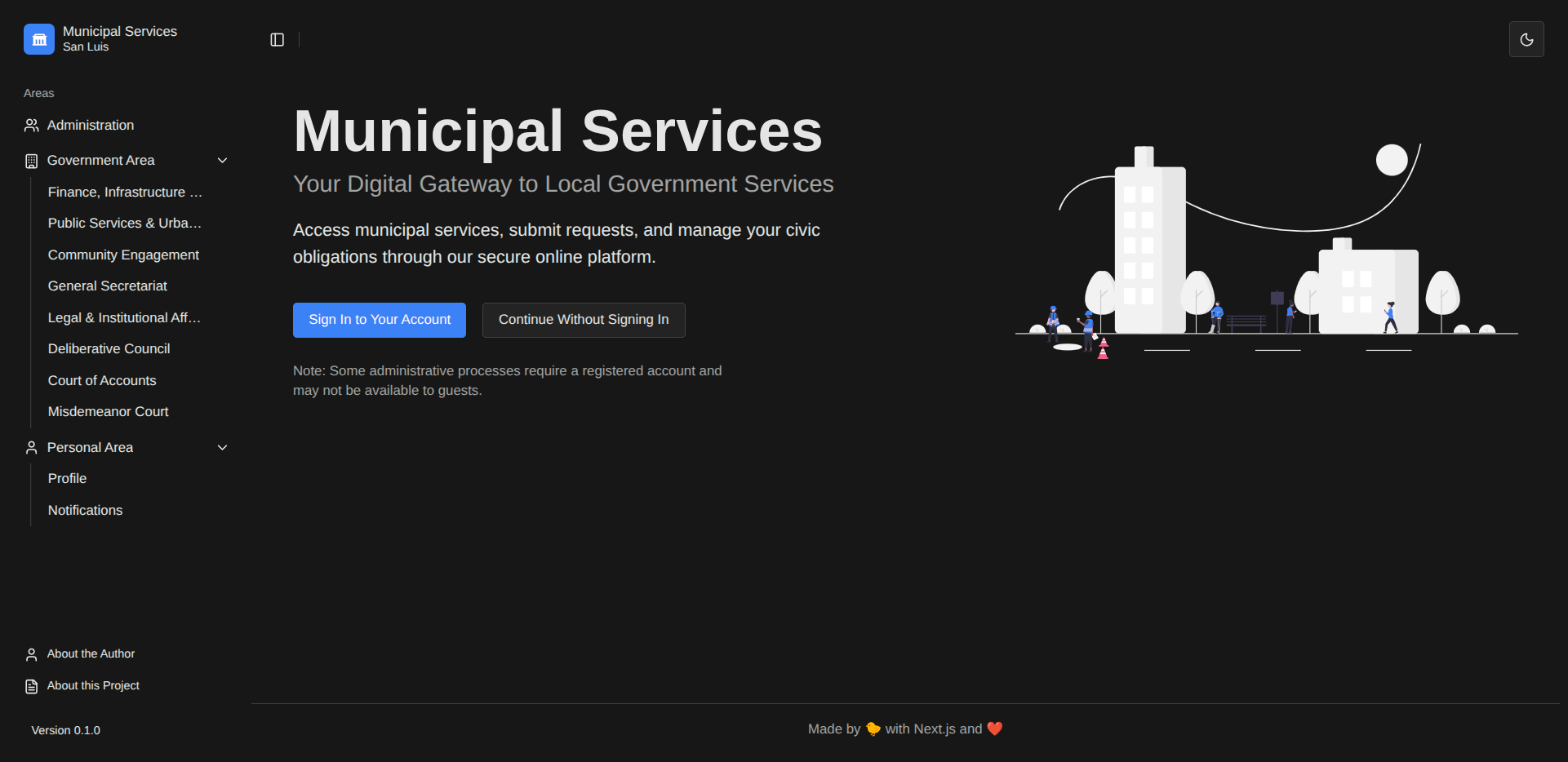
We now have:
- A professional, collapsible sidebar
- Route-based navigation that scales with your app
- Dark mode support (finally!)
- Consistent header and footer
- A single source of truth for routes
The UI foundation is solid and maintainable. As you add new routes, simply mark them with sidebarContent and they automatically appear in the navigation.
What’s Next?
Before we delve into building out the actual features of our large software project, it is a perfect time to stabilize the system through testing. Our next phase will focus on unit and integration testing to ensure that all these newly created moving parts function as intended and remain stable as the project grows.
But that’s a topic for the next post. For now, enjoy your dark mode and professional layout! 🎨
Next Blog: Large Software Projects: Unit Testing